ABSOLUT VODKA
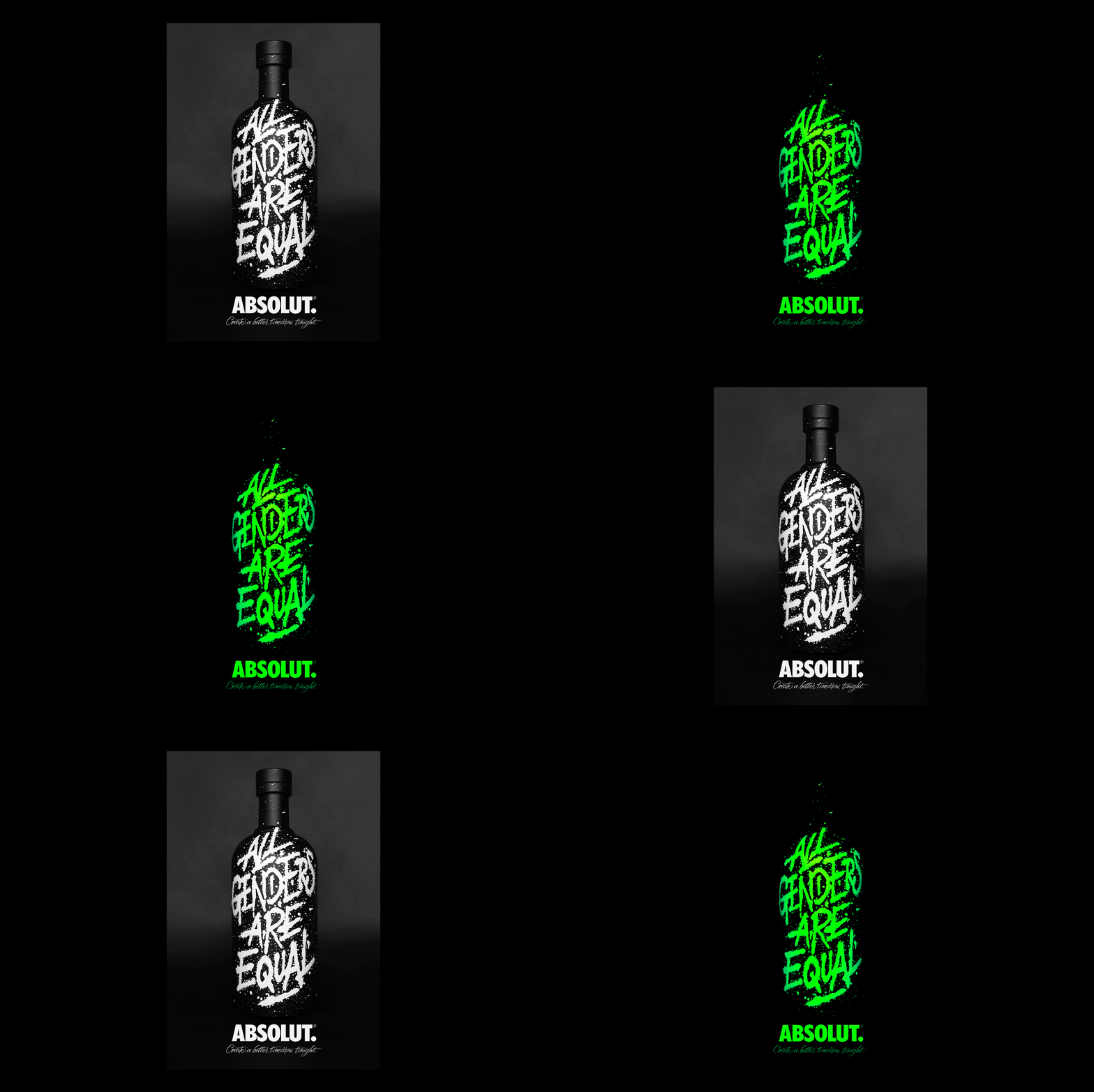
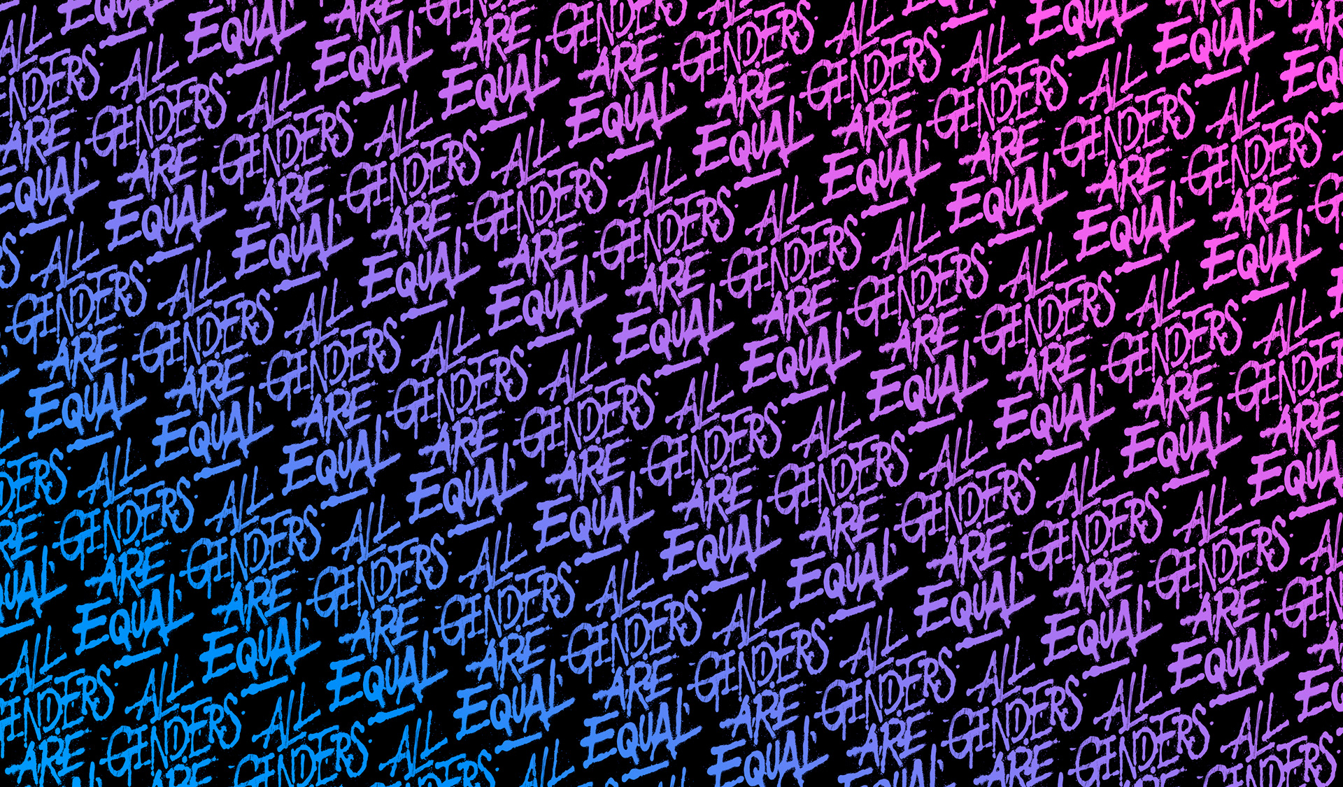
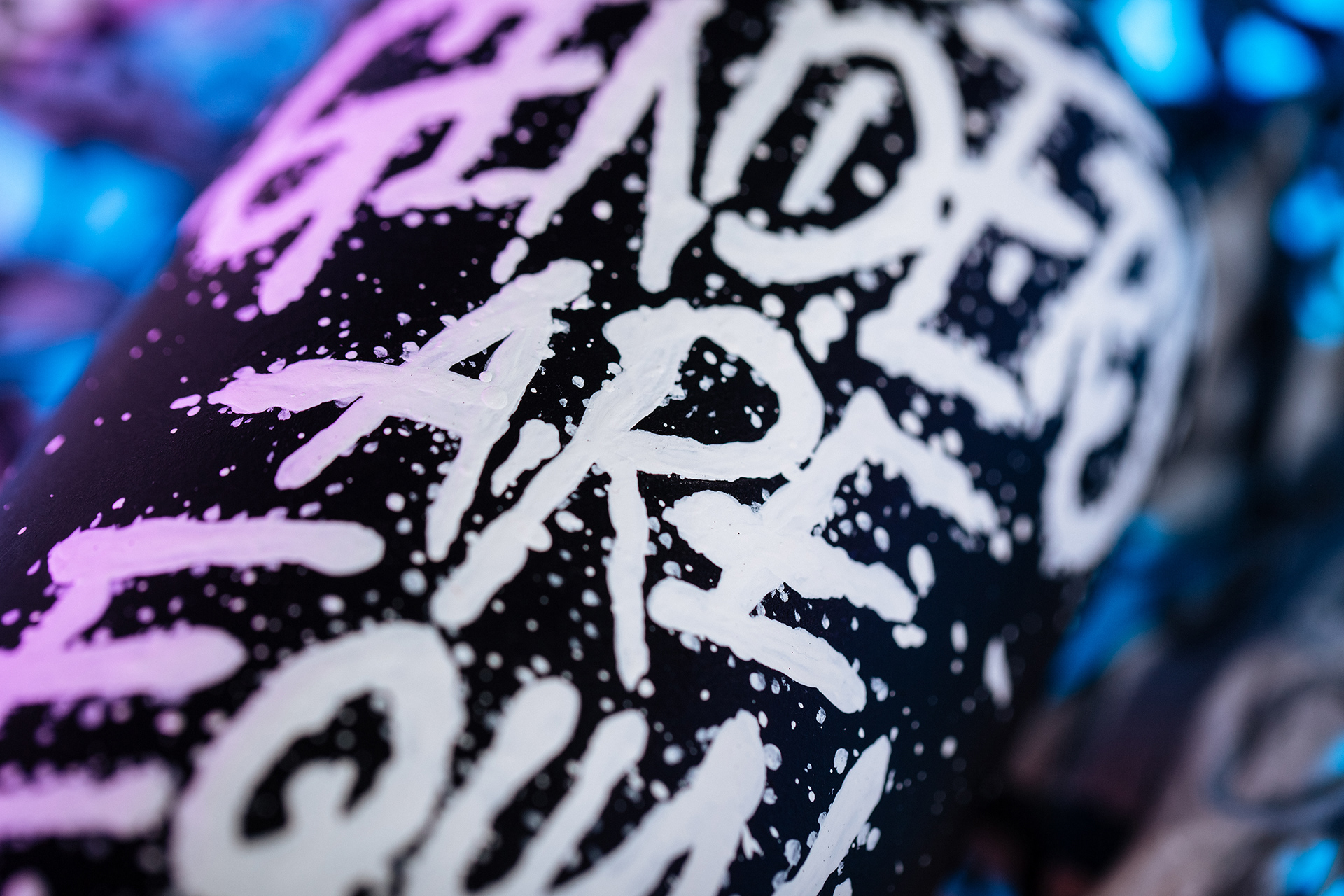
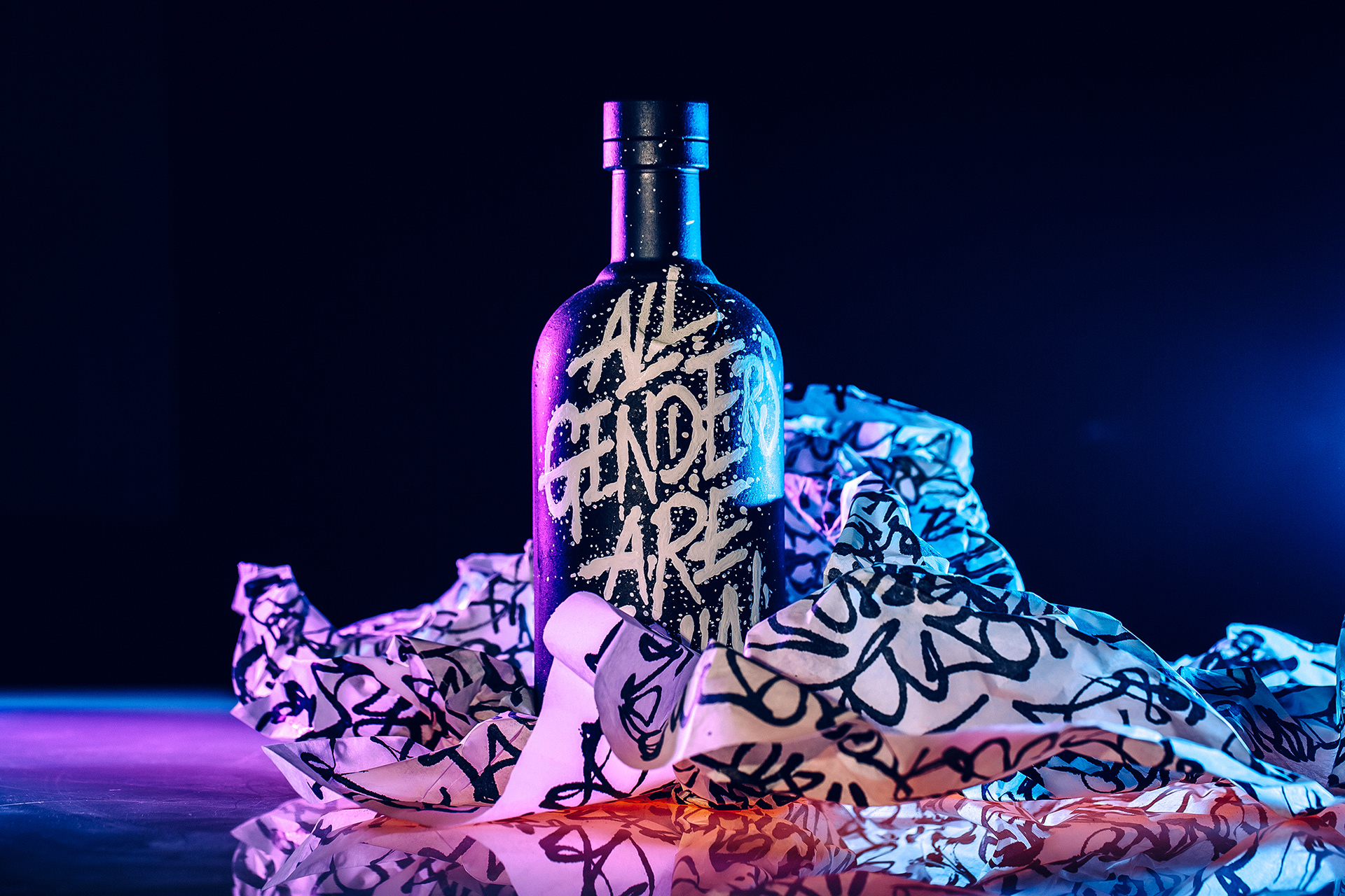
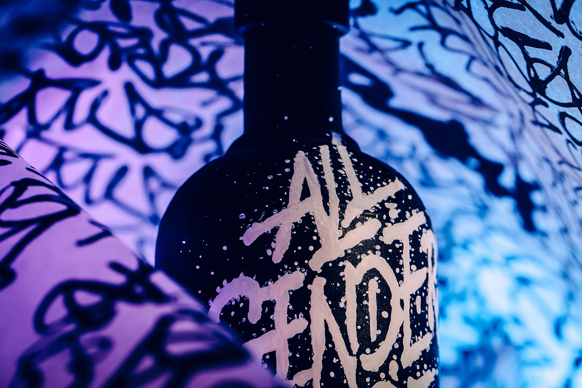
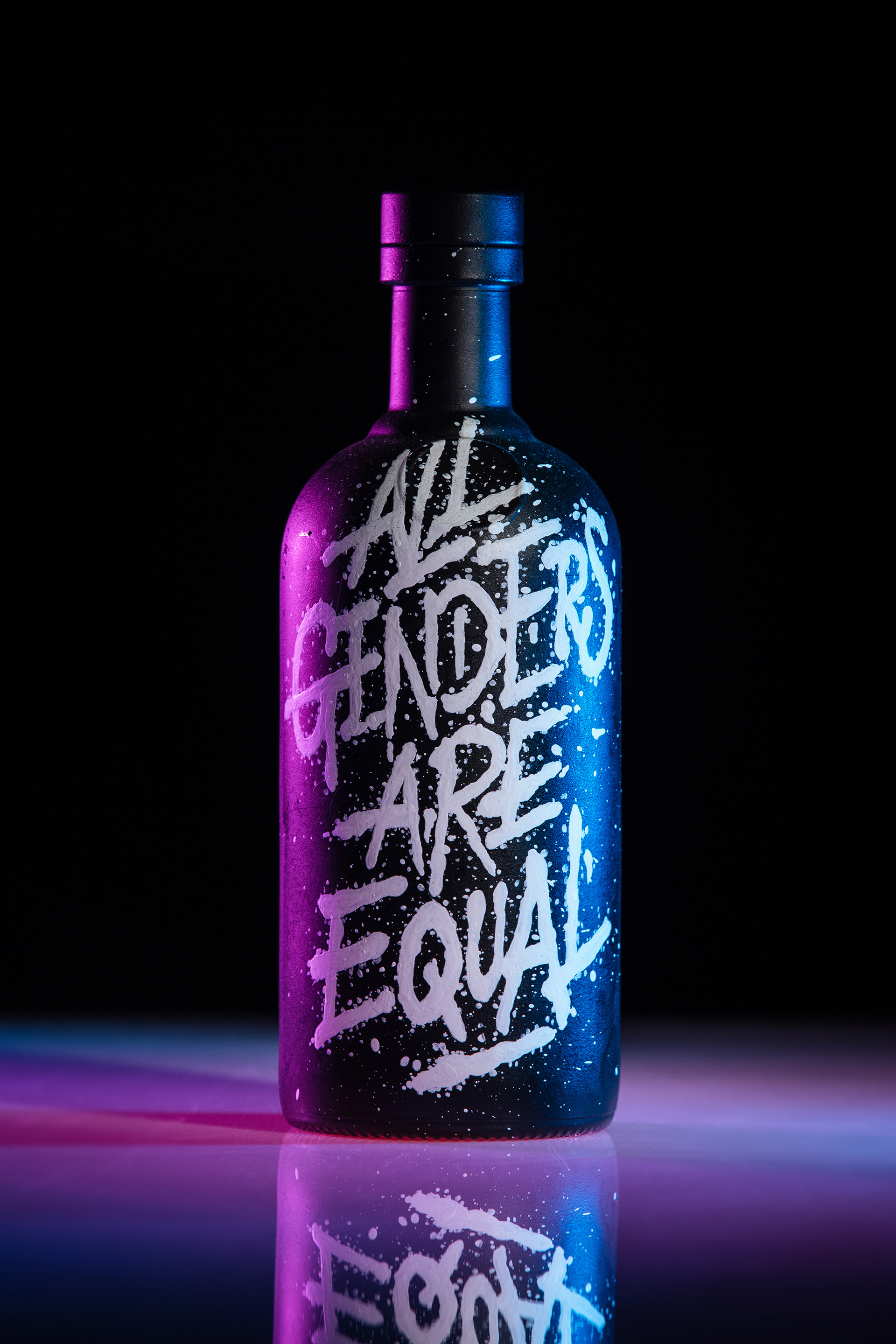
ALL GENDERS ARE EQUAL
ALL GENDERS ARE EQUAL
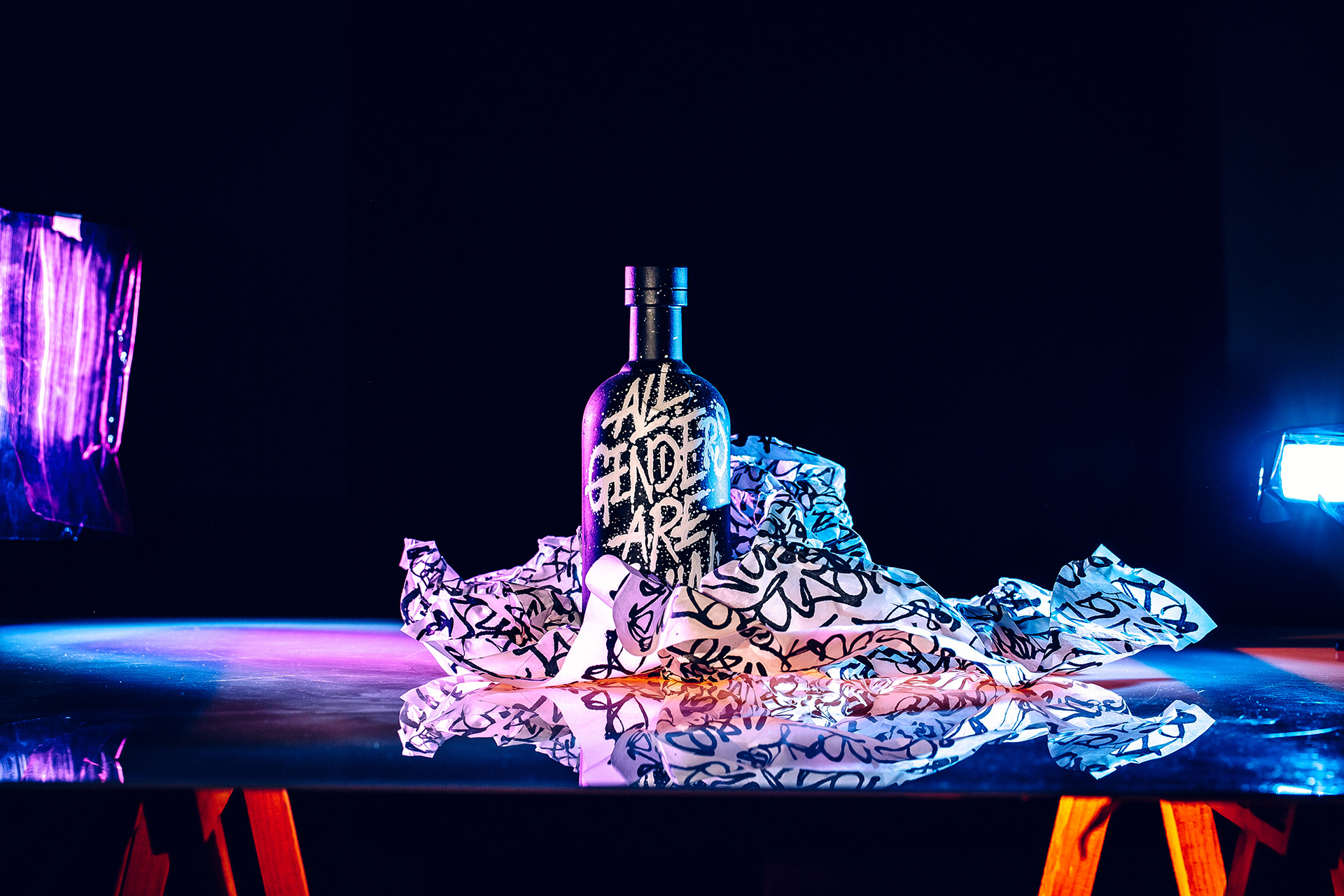
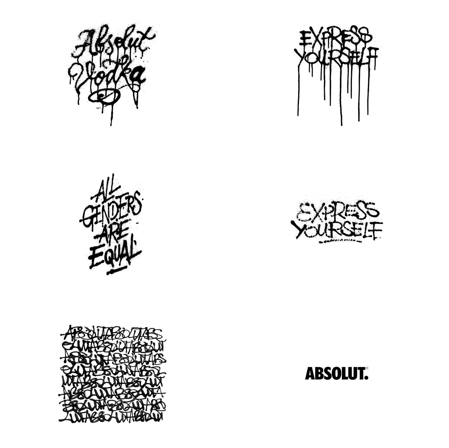
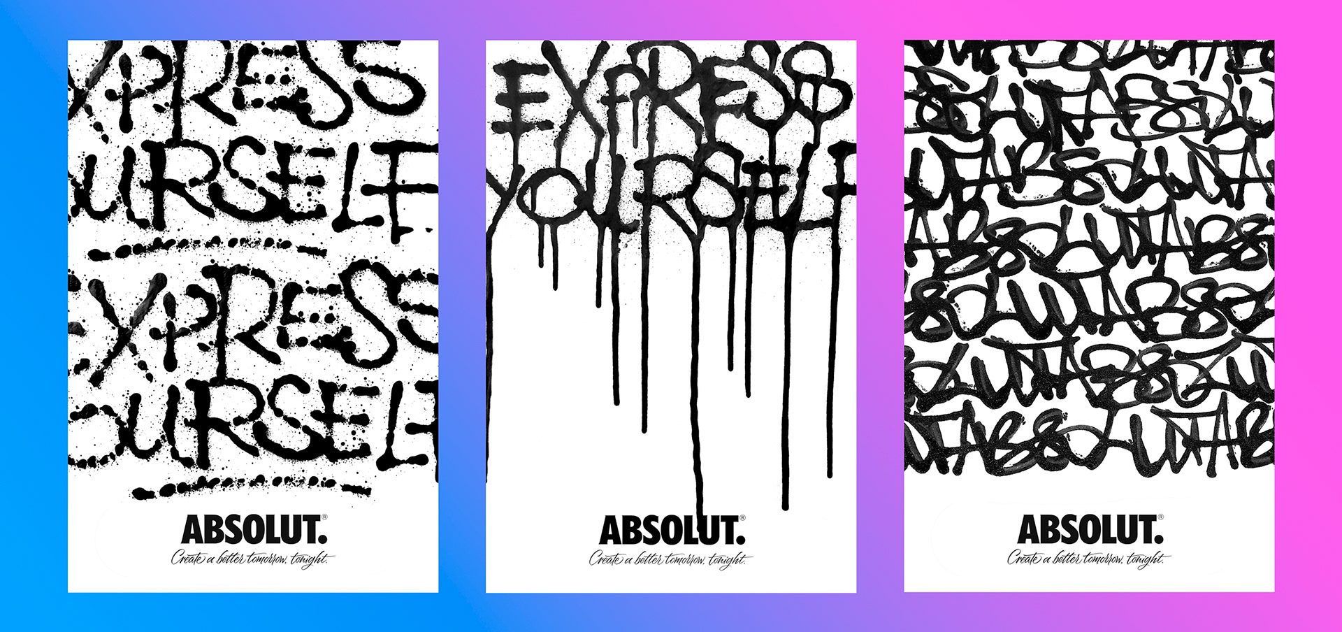
Poster for Absolut Vodka competition 2019.
The general idea behind the final prototype was held by three main concepts:
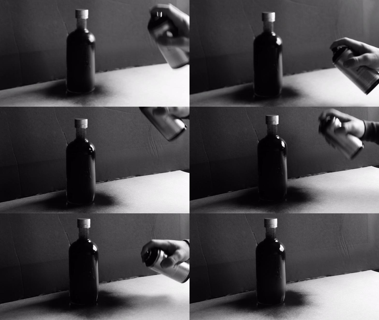
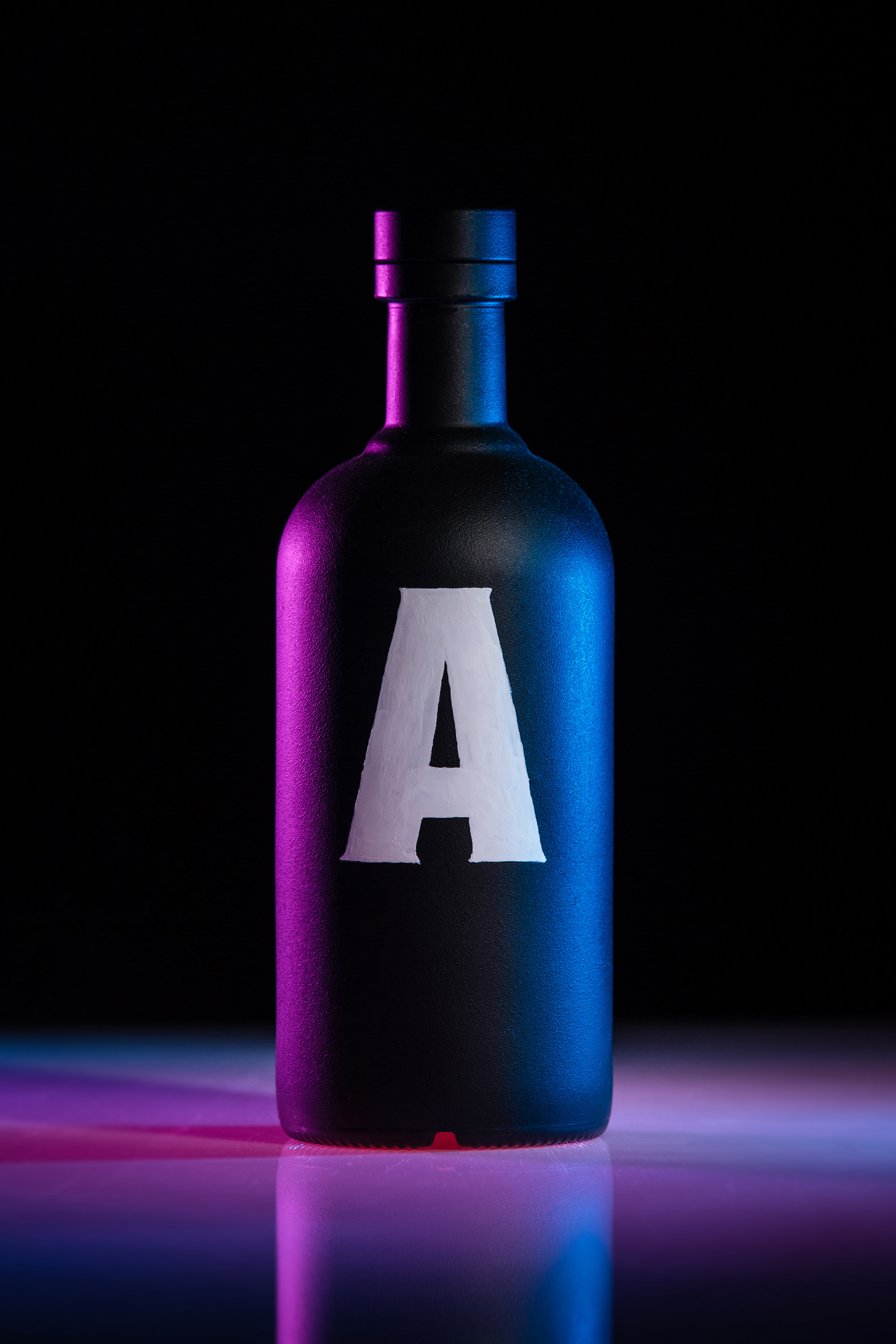
01 — The color black is proven to be the combination of all colors, thereby meaning that “ALL GENDERS ARE EQUAL”.
02 — The color white is, by defect, the absence of all colors, meaning, in this creative context that, all differences aside, we are the all same, therefore, equally human.
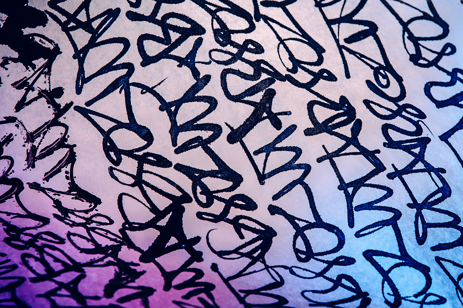
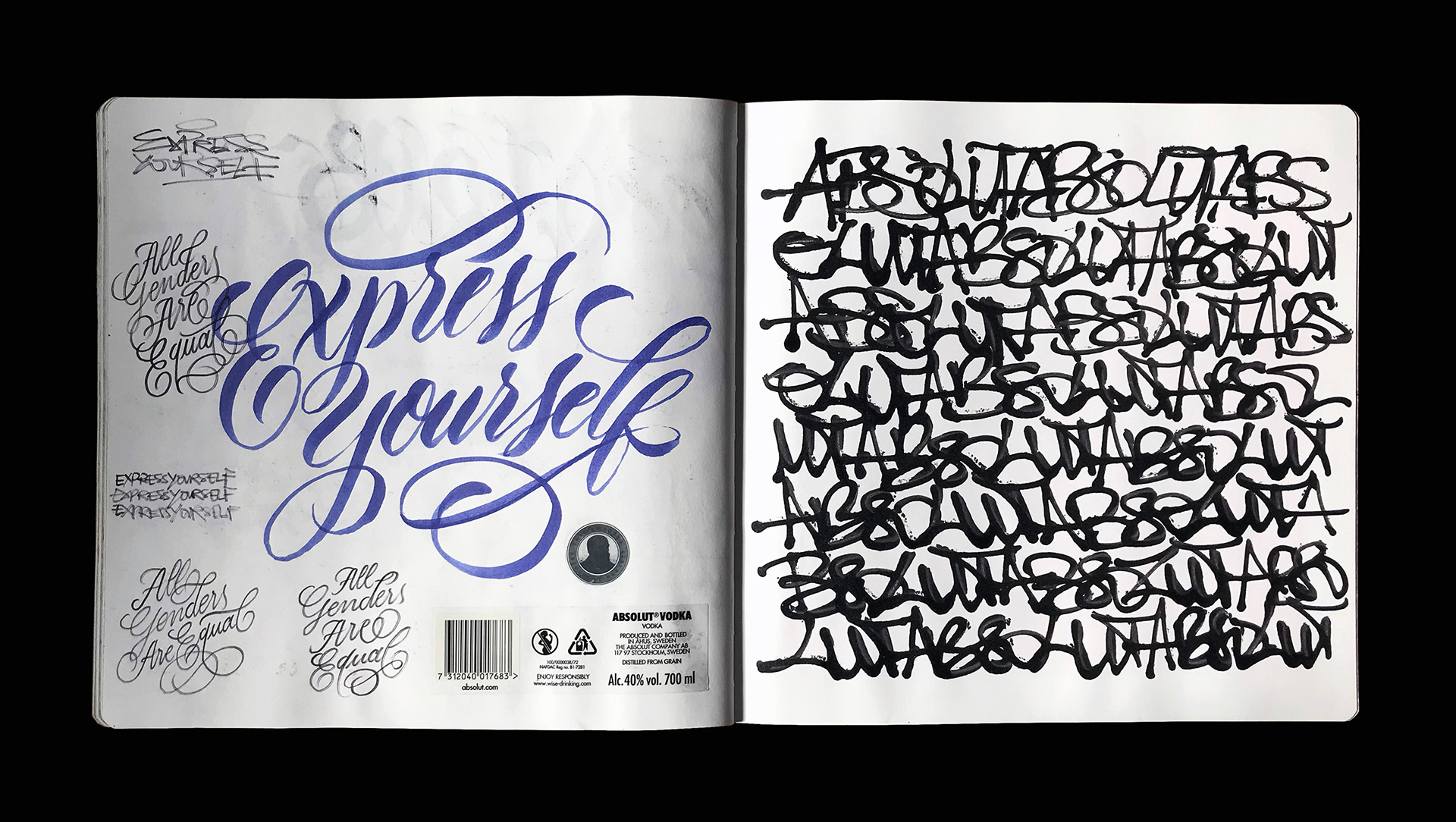
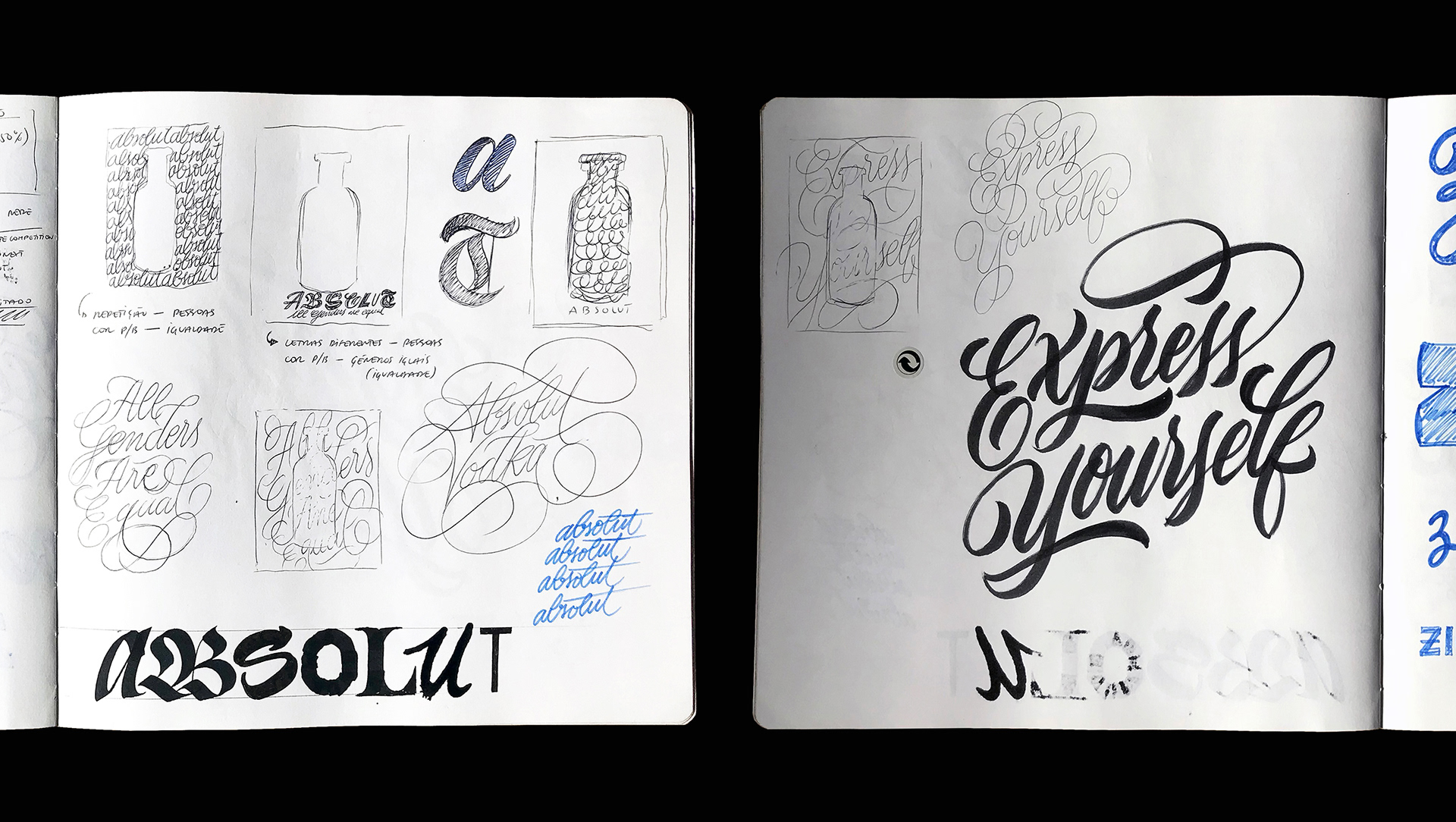
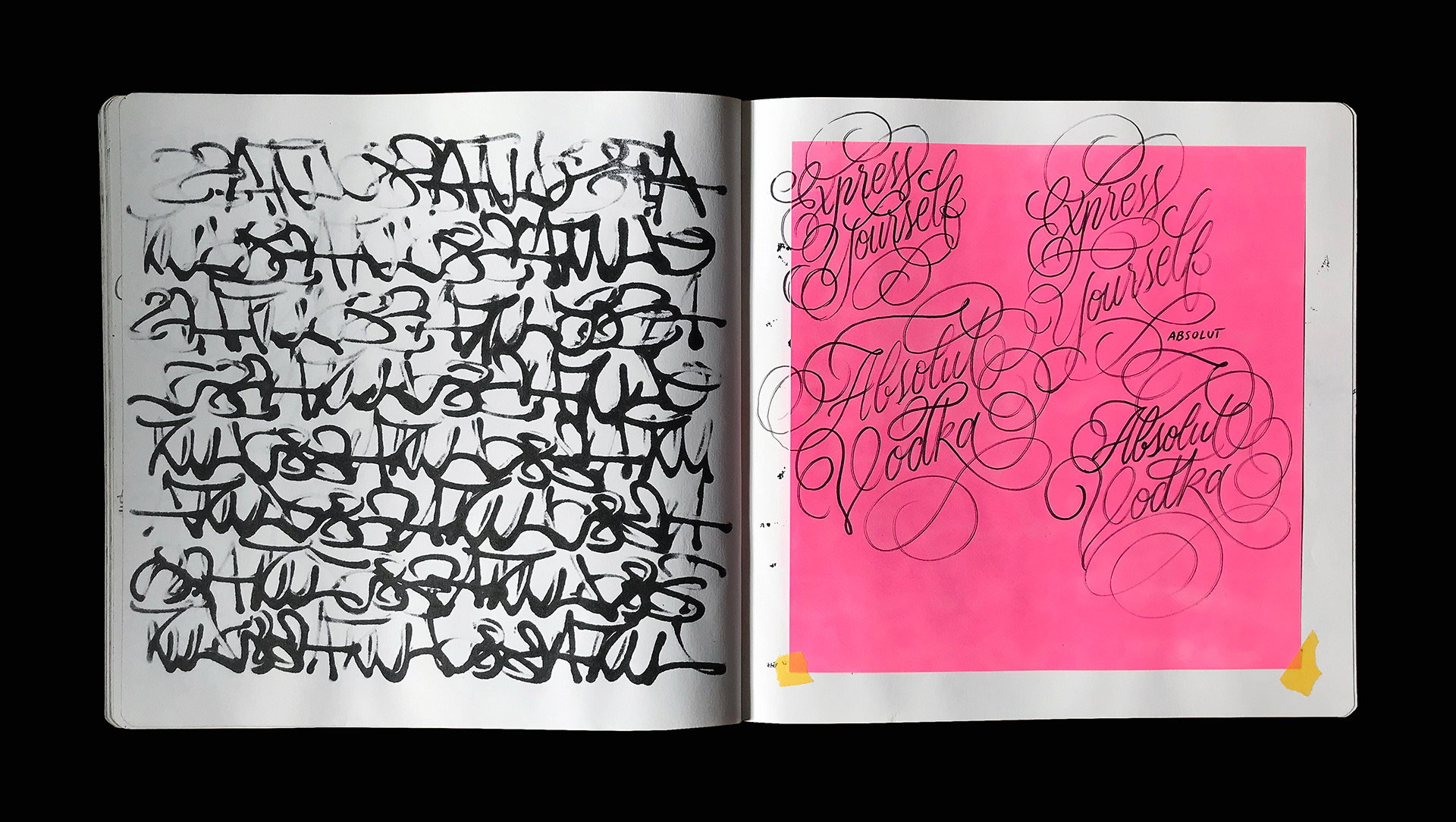
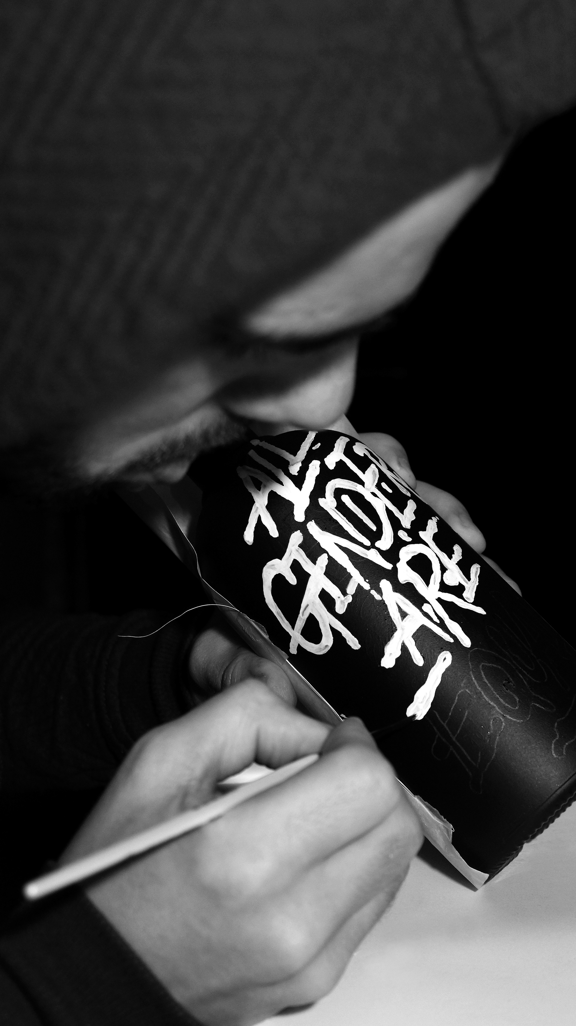
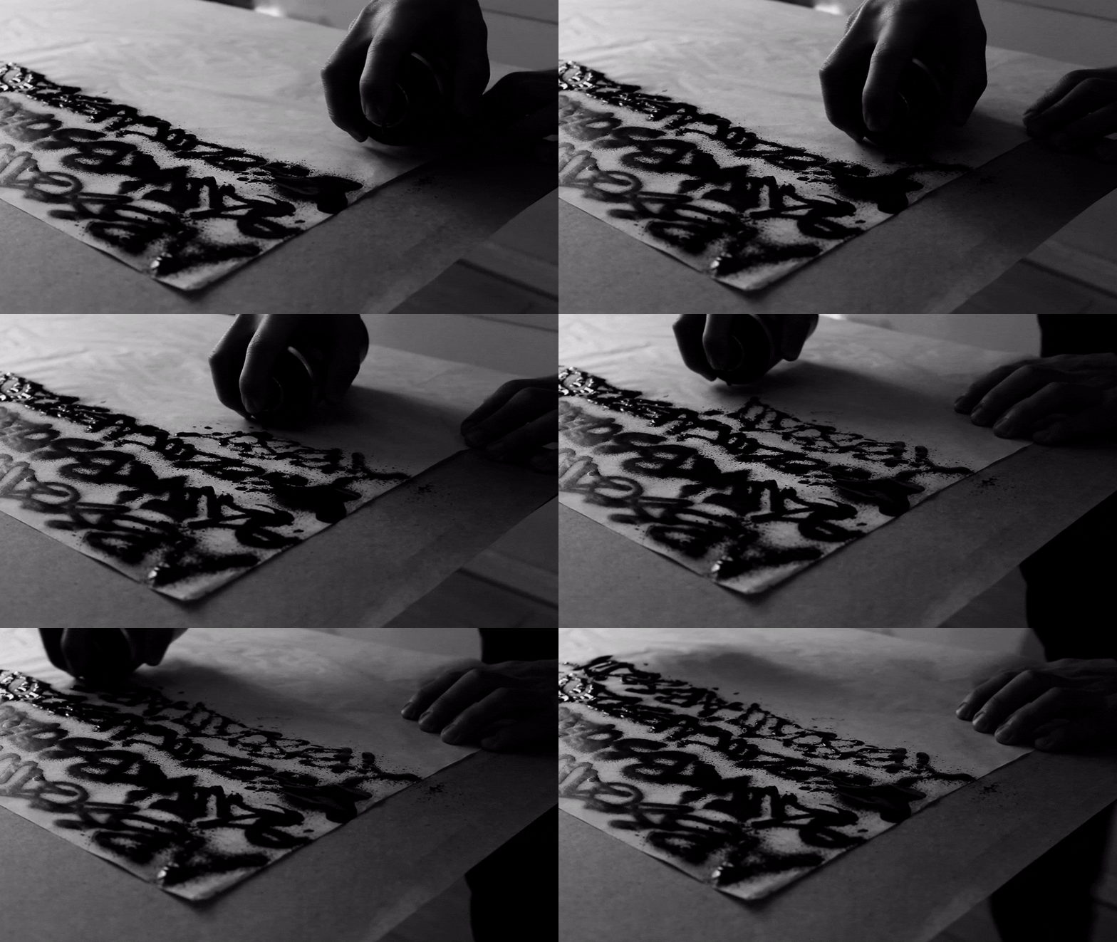
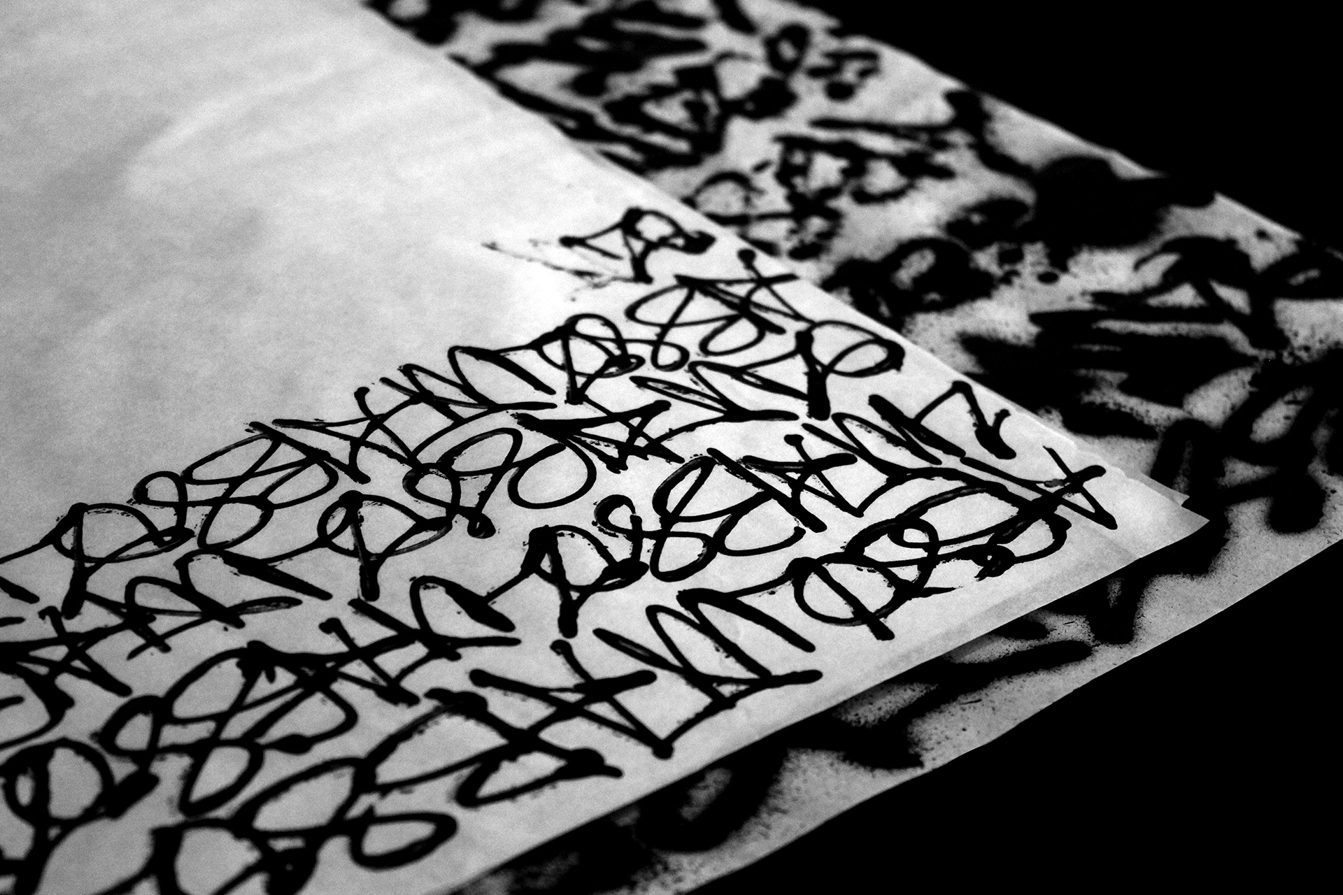
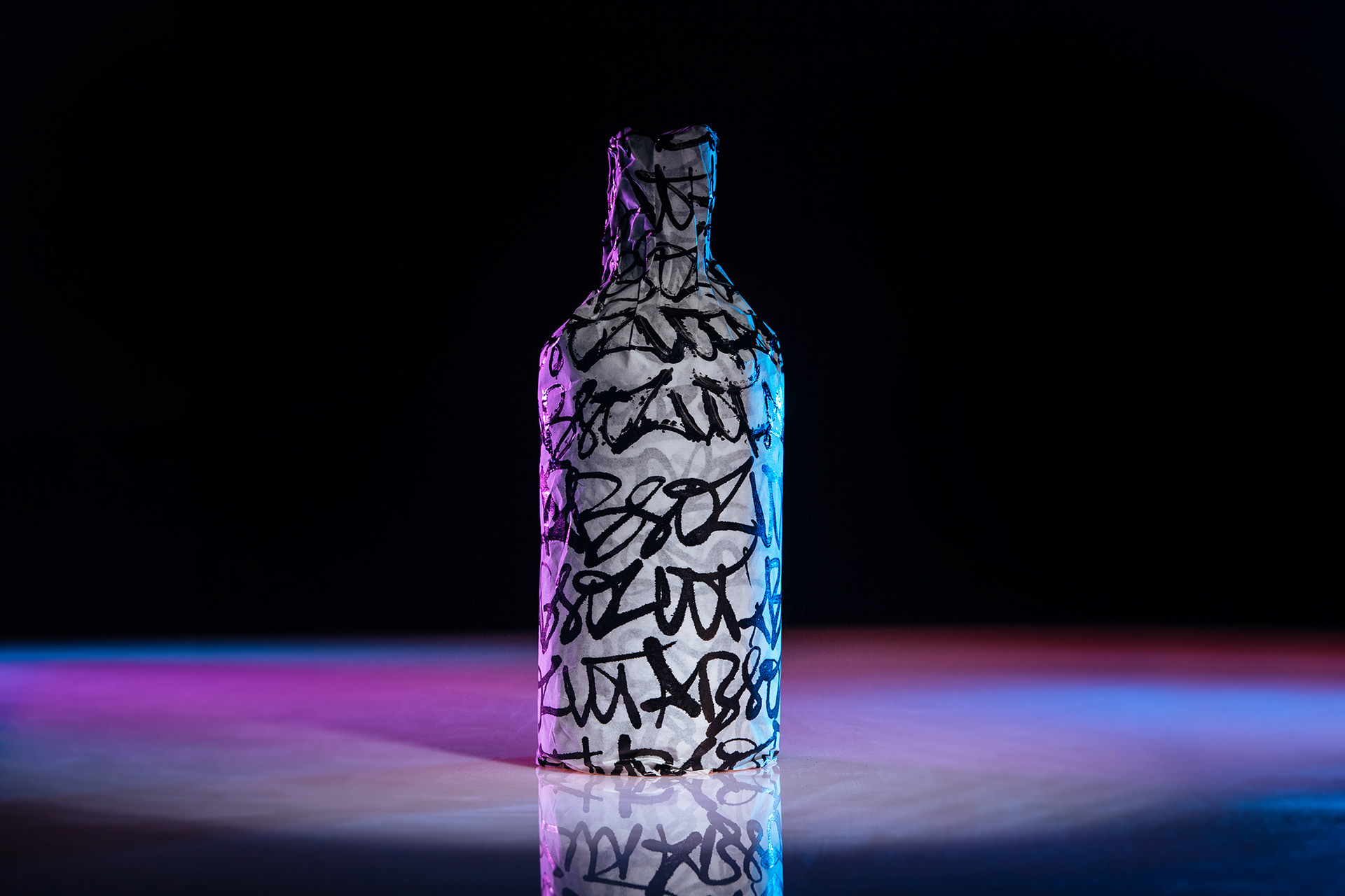
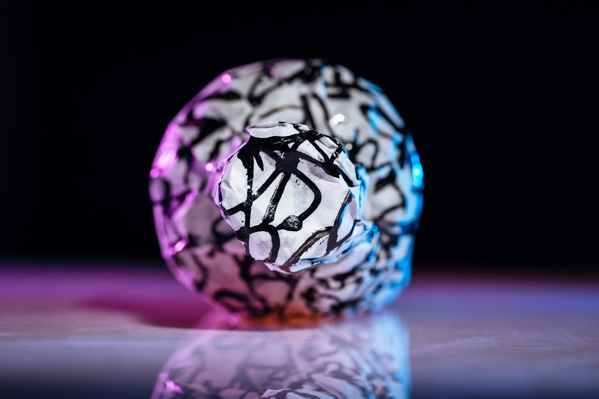
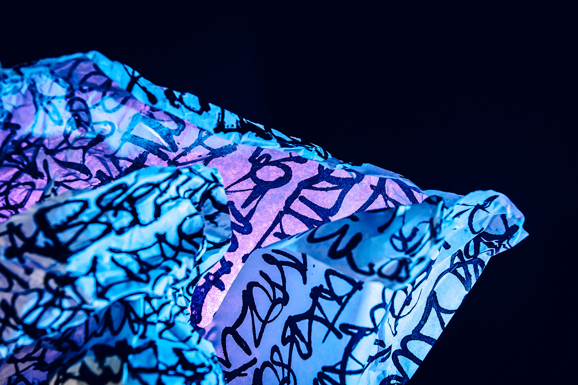
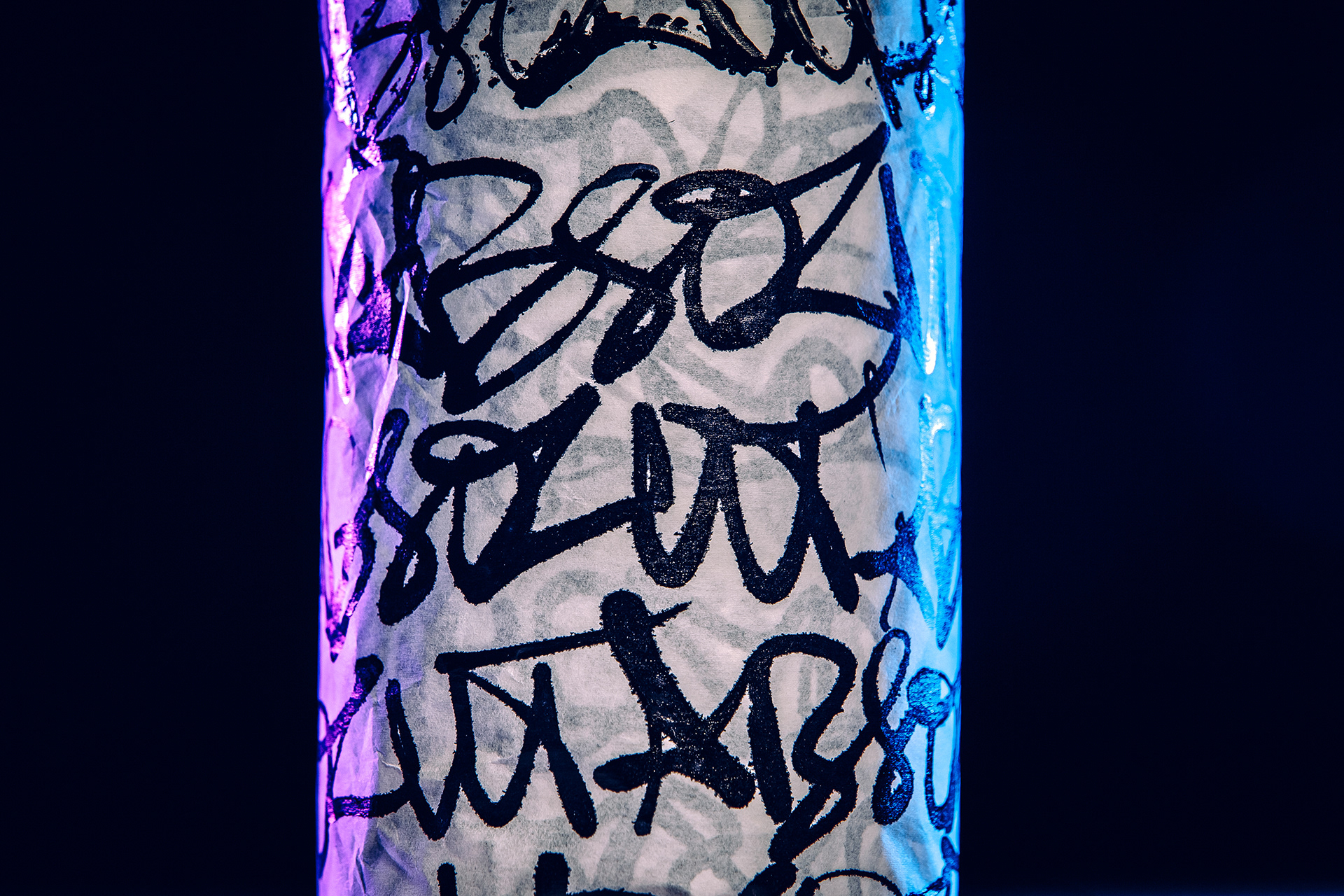
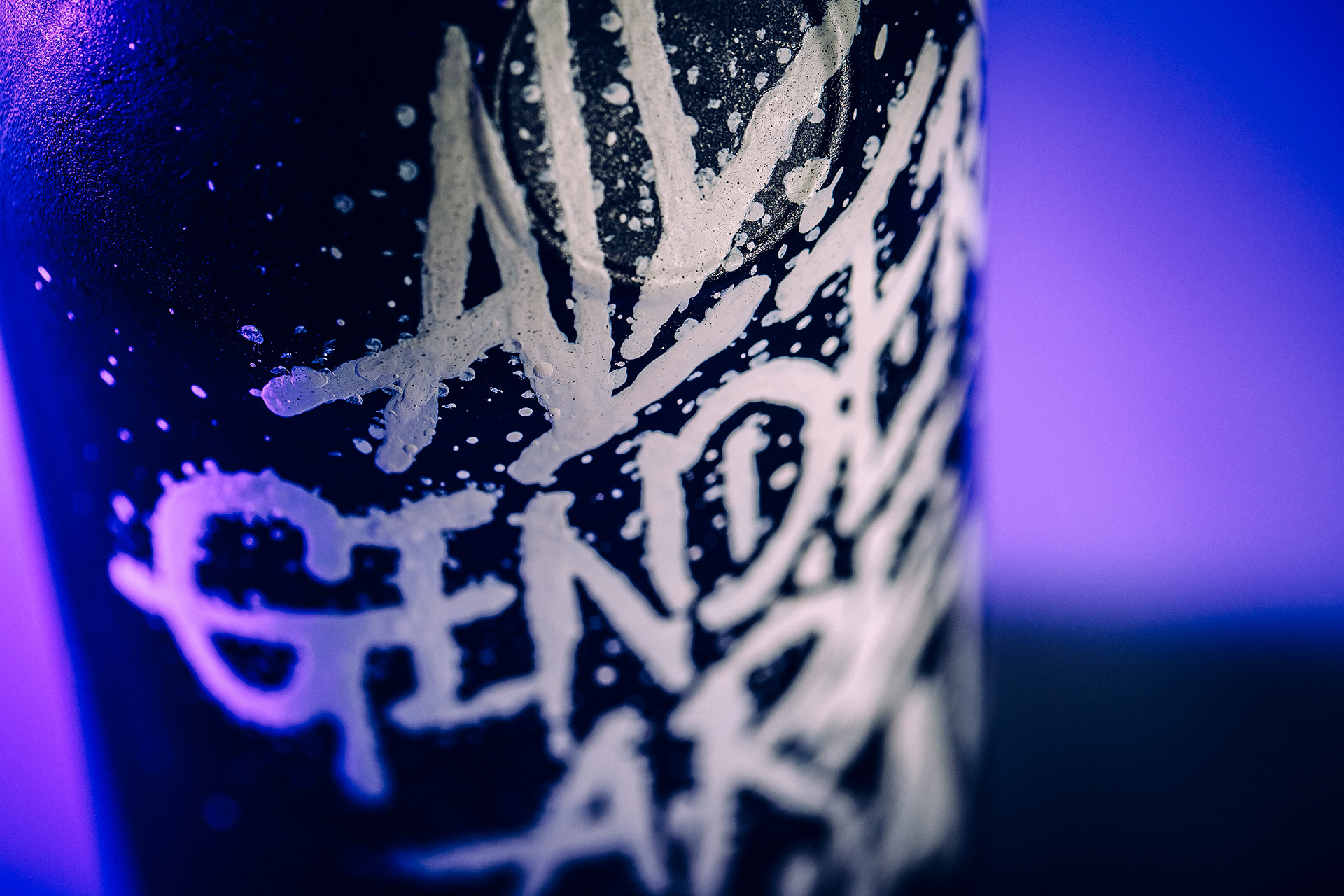
03 — In a third and final statement, I wanted to highlight the importance of handcrafted work. I truly believe that we are made of imperfections. The imperfections that we find within ourselves are not what defines us, but what allows us to grow up and grow further in our understanding of what’s fundamental. Handcrafted is imperfect. We are too. Individually flawed, though enriched; as we all are, equally imperfect.
In conclusion, the idea was to emphasize the colors that are symbiotical connected. Black represents what unites us all, and white what makes us individually unique. The hand-painted lettering translates imperfection.
Client
Absolut Vodka - Competition 2019
Absolut Vodka - Competition 2019
Design / Customization
Xesta Studio
Xesta Studio
Product Photography
Álvaro Martino
Álvaro Martino
Work Process Photography
Ana Tigre
Ana Tigre
Assistant
Daniel Rodrigues
Daniel Rodrigues
Year
2019—2020
2019—2020
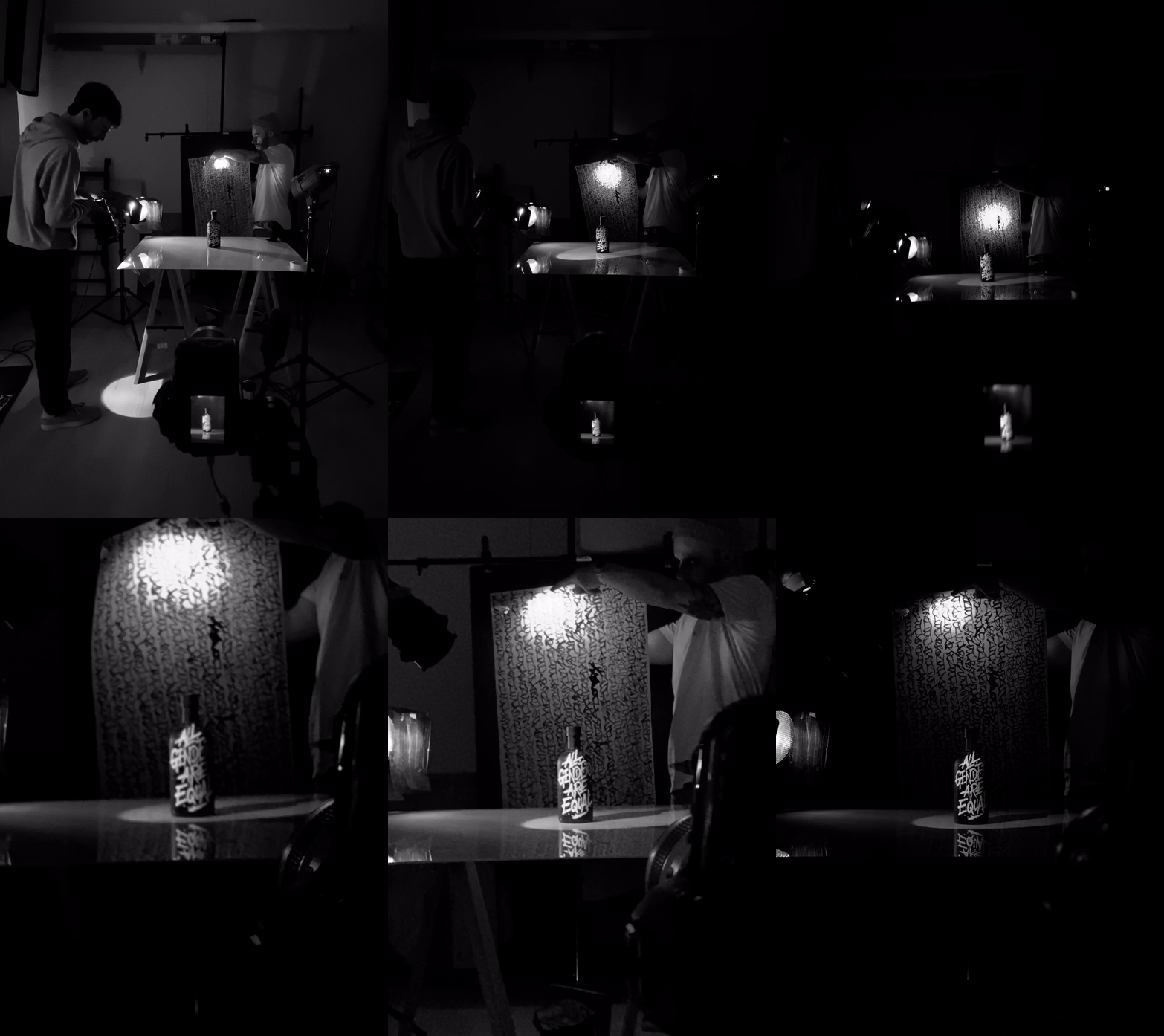
BEHIND THE SCENES
